As an avid hiker, one of the best things about hitting the trail is what happens when your mind starts to wander and the trail does the thinking for you. The questions start coming on their own.
Who planned this route? Why does it go this way and not another? Who was it built for?
As a UX researcher, I can’t turn those questions off. On the trail, they hit differently, because the answers are right there if you know what to look for.
The Research Happens Before Anyone Picks Up a Shovel
Trail builders walk a property for weeks before anything gets cleared. They’re not hiking. They’re reading.
Slope angles, drainage patterns, soil composition, wildlife corridors, old logging cuts that might serve as natural throughlines. A single plot of land can end up covered in different-colored flags as teams map, argue about, and re-map potential routes. Sometimes the terrain gives you a clear answer. Other times, crews debate the exact placement of a single switchback the way a product team debates a navigation pattern: the wrong call costs you later, and fixing it is expensive.
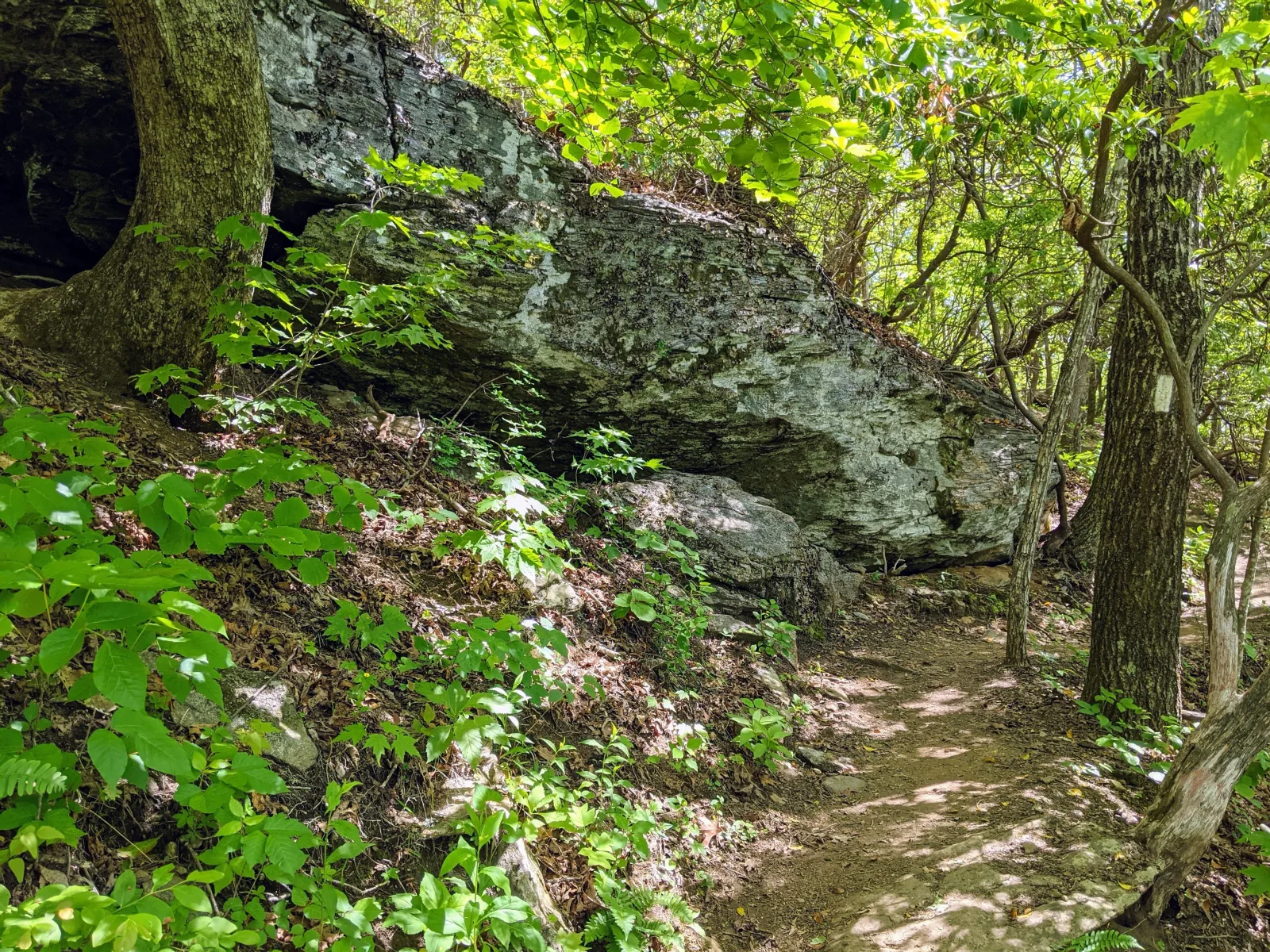
The National Park Service codified its trail design standards in the 1920s and 1930s around a principle that’s almost philosophical: features should be “laid gently on the land.” No straight lines. No right angles. Local stone and wood only. They weren’t trying to impose a path on the environment. They were trying to find one it was already suggesting.
Good research works the same way. You’re not confirming a direction you already picked. You’re looking for what the terrain is telling you.
The Width of a Trail Is a Research Finding
Trail designers document something called Trail Management Objectives before construction starts: who’s coming, what should they feel, how hard should this be, what might they do wrong.
That last question is where most designs go wrong.
Designers know that people follow the path of least resistance. Not as a metaphor. Literally. So the direction and grade of a trail gets engineered to make the safe, sustainable choice the obvious one. Switchbacks aren’t just an elevation solution. They’re a behavior intervention. Without them, hikers cut straight up the slope, destroy the vegetation, and kick off an erosion problem that takes years to undo.
Trail width is a research output too. A narrow single-track suits experienced hikers who want to move. But families on a weekend outing, neighbors who walk side by side, older adults who might need to let someone pass? Different width, different surface, different experience. The trail accommodates the behavior it expects, not the behavior it wishes for.
When you design for the user you want instead of the user you have, you’re building the wrong trail.
Signage is where the stakes get serious. Yosemite National Park sees around four million visitors a year, and its search and rescue team responds to roughly 250 rescues annually. Nearly 70% of those are lost or injured hikers. When the NPS looked at why, the leading causes weren’t bad weather or reckless decisions. They were losing the trail accidentally, taking a wrong turn at a junction, and miscalculating time or distance. The contributing design factors: inadequate signage placement, poor typography, and missing markers at decision points.
People didn’t get lost because the trail was hard. They got lost because the right information wasn’t in the right place in a form anyone could act on. If you swap “trail” for “product,” you’ve got the same problem.
The First Version Is Never the Final Version
The Appalachian Trail is a 2,190-mile footpath running from Georgia to Maine, one of the longest marked hiking trails in the world. Most people don’t know that its southern terminus wasn’t always Springer Mountain. That distinction belonged to Mt. Oglethorpe, further south, until the first version fell apart and the route was rerouted north.
The trail’s Georgia section was first scouted in 1929 largely from maps, with minimal field survey. It seemed reasonable on paper. Within a few decades, the area around Mt. Oglethorpe had been overrun by development, vandalism, and trail-side chicken coops that made the route unusable. The terminus was moved 20 miles north to Springer Mountain in 1958, chosen because it sat on public land, had no direct road to the summit, and the approach was challenging enough to discourage casual crowds.
The first version failed in the field and they fixed it.
Bear Mountain in New York is a different kind of failure. It became the most visited section of the entire AT, drawing over 100,000 hikers a year. The original construction was never designed for that volume. By the early 2000s, the trail had eroded so badly that in some places it was 80 feet wide.
From 2005 to 2018, a 14-year project rebuilt 3.9 miles of it from scratch. Workers installed 1,300 granite steps, each one split and shaped on site, moved into place by hand or rigged through the trees on overhead cables. The rebuilt section also became the first ADA-accessible summit section on the entire AT. The trail that failed because of its own success was redesigned to handle what it had become, not what its builders originally imagined.
You don’t ship something and hand it off. The trail doesn’t maintain itself. Neither does your product. Build it knowing maintenance and iteration never stop.
The Next Time You’re Out There
Look at the grade on the trail under your feet. The steps and how they were built. The width of the cut. The placement of the marker at the fork. Somebody made those calls with limited budgets, incomplete information, and a user population they couldn’t fully predict. They got some of it wrong, rerouted, and tried again.
It’s the same work we do. With better views.
If you’re in the Atlanta area, I put together a follow-up looking at the design decisions behind some of the trails closest to home, from Sweetwater Creek to Preacher’s Rock. That’s next.
If you’re working through research or product design challenges of your own, let’s talk.